
 EN
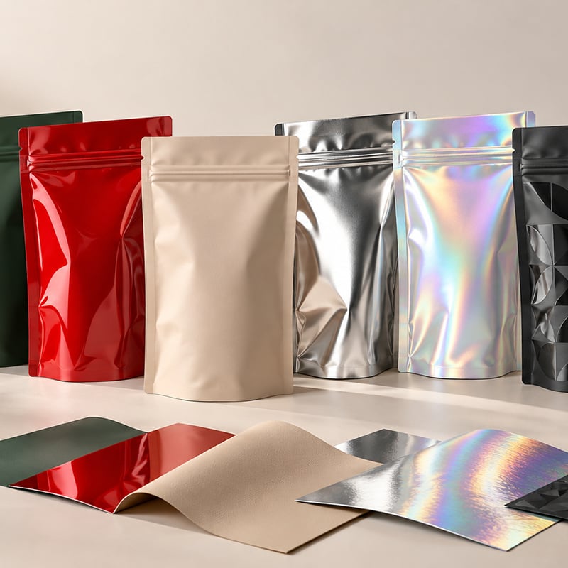
In flexible packaging, print quality is only part of the brand experience. The surface finish—how a pouch reflects light, feels in the hand and catches attention on the shelf—can influence how customers perceive a product before they read a single word.
A matte coffee pouch can feel refined and understated. A glossy snack bag can make colours look brighter and more energetic. A soft-touch surface can make a product feel premium at first touch, while metallic, holographic, Spot UV and hot foil details can create a stronger visual focal point.
At Cailyn, we help brands select packaging effects as part of the complete production plan—not as a last-minute decoration. The right finish must work with the pouch material, product category, printing route, budget and intended shelf environment.
Three Ways Packaging Effects Are Created
Packaging effects are usually created in one of three ways:
Surface appearance treatments, such as matte, gloss and soft-touch finishes
Material-based effects, such as metallised, aluminium-based or holographic films
Local decorative finishes, such as Spot UV and hot foil applied to selected design areas
Each option affects not only appearance, but potentially pouch durability, friction, barrier structure, production complexity and cost.
Matte, Gloss and Soft-Touch: How Surface Finish Changes Brand Perception
Matte, gloss and soft-touch finishes are often used to define the overall look and feel of a flexible pouch. Depending on the packaging structure, the result may be achieved through surface film selection, varnish, ink systems or laminate construction.
Matte Finish
Matte packaging reduces shine and creates a calm, refined appearance. It is commonly used for specialty coffee, tea, supplements, premium snacks and natural-positioned brands.
A matte pouch works particularly well with minimalist typography, earthy colours and clean product photography. It is also often easier to photograph under retail lighting because it produces less glare than a high-gloss surface.
However, dark matte pouches can show scratches or scuffing more easily during shipping and shelf handling. For this reason, abrasion resistance should be considered during material selection.
Gloss Finish
Glossy packaging has a brighter, more reflective surface. It can enhance colour saturation and contrast, making it a strong option for snack foods, confectionery, candy, children’s products and promotional packaging.
Gloss works well when the brand uses colourful graphics, product photography or bold visual elements. It can help a pouch stand out in a busy retail environment, especially under strong shelf lighting.
The trade-off is that glossy finishes may show fingerprints, reflections and minor surface marks more visibly than matte finishes.
Soft-Touch Finish
Soft-touch packaging has a velvety, smooth tactile effect, usually combined with a low-gloss or matte appearance. It is often used for premium coffee, beauty products, luxury snacks, gift packaging and high-end product launches.
Soft-touch is not only a visual choice—it is a tactile branding tool. It can make a pouch feel more considered and premium before the customer opens it.
Because soft-touch surfaces can have different friction, scuff-resistance and handling characteristics, brands should confirm suitability for their filling process, logistics conditions and retail channel.
Metallic and Holographic: Material-Based Shelf Impact
Metallic and holographic effects are usually created through the packaging material itself rather than only through ink or surface coating.
Metallic Effects
Metallic effects can be created with metallised film, aluminium-based structures, metallic inks or decorative foil elements. They are popular for coffee, snacks, supplements, confectionery and premium retail products because they create a reflective, high-value appearance.
A metallic effect can be used across the entire pouch or only in selected areas, depending on the artwork and packaging structure. Gold, silver, bronze and coloured metallic effects can all support different brand styles—from luxury and heritage to bold and modern.
It is important to distinguish appearance from performance. Some metallised or aluminium-based structures can also support barrier requirements, but the final barrier performance must be selected according to the product, target shelf life and material structure—not simply based on a metallic visual effect.
Holographic Effects
Holographic or laser films create a dynamic, light-reflecting effect that can shift in appearance as the pouch moves. They are especially effective for limited editions, youth-focused snacks, beauty products, collectibles, promotional packs and seasonal launches.
A holographic finish can be used as a full pouch background, a narrow panel, a logo area or a selected decorative detail. It creates strong shelf impact without relying only on bright printed colours.
Before production, brands should confirm the holographic pattern direction, the relationship between the design and film pattern, and whether important information such as barcodes or small text needs a clear, stable background.
Spot UV and Hot Foil: Local Decoration for Flexible Pouches
Spot UV and hot foil are not limited to cartons and labels. Both can also be used on flexible pouches when the material structure and production process are designed accordingly.
Spot UV
Spot UV is a localised gloss effect applied to selected areas of the design, such as a logo, product name, illustration or pattern. It is particularly effective when placed on a matte or soft-touch background because the contrast between the glossy and non-glossy areas makes the design more noticeable.
Standard Spot UV creates visual gloss contrast. Raised UV or textured UV can add a more tactile, dimensional effect where the process is suitable.
For flexible packaging, Spot UV can help a brand emphasise a key logo, flavour name or graphic element without changing the appearance of the entire pouch.
Hot Foil
Hot foil uses heat and pressure to transfer a metallic foil to selected parts of the design. Gold and silver are common choices, but coloured foils, holographic foils and special metallic tones can also be used.
On flexible pouches, hot foil can create a sharper and more premium metallic detail than a printed metallic effect. It is well suited to logos, borders, icons, limited-edition marks and premium product names.
Because hot foil and Spot UV require accurate registration and compatible material construction, they should be discussed early in the packaging-development process. The artwork, pouch format, finish area, order quantity and expected handling conditions all influence the most practical solution.
Choosing the Right Finish for Your Product
| Finish or effect | Best suited for | Brand impression | Key production consideration |
|---|---|---|---|
| Matte | Coffee, tea, supplements, premium snacks | Calm, modern, refined | Confirm scuff resistance, especially on dark colours. |
| Gloss | Candy, chips, confectionery, colourful snacks | Bright, energetic, bold | Reflections and fingerprints can be more visible. |
| Soft-touch | Premium coffee, beauty, gifts, luxury snacks | Velvety, elevated, tactile | Check abrasion resistance and compatibility with filling or handling. |
| Metallic | Coffee, snacks, supplements, confectionery | Premium, high-energy or luxury | Select the structure based on both appearance and required barrier performance. |
| Holographic | Limited editions, youth-focused brands, promotional packs | Dynamic, playful, attention-grabbing | Confirm film pattern direction and readability of important information. |
| Spot UV | Premium pouches, labels, cartons and gift packaging | Focused gloss contrast and detail | Best used selectively; confirm registration and surface compatibility. |
| Hot foil | Premium pouches, labels, folding cartons and gift boxes | Crisp, luxurious metallic detail | Confirm foil area, artwork registration, pouch material and production route. |
Finish Selection Should Start with the Full Packaging System
The best-looking finish is not always the best production choice. A packaging effect should be selected together with the pouch format, material structure and product requirements.
For example:
A premium coffee bag may use a matte or soft-touch surface with Spot UV on the logo and a metallic detail for the product name.
A snack pouch may combine a glossy finish with a metallised structure for stronger shelf impact.
A seasonal candy launch may use holographic film with selective hot foil decoration.
A natural granola brand may choose a matte kraft-look pouch with restrained gloss details rather than a highly reflective finish.
The final decision should also account for the product’s barrier needs, filling method, shipping conditions, retail lighting and target price point.
Printing Route, Quantity and Finish Availability
Not every finish is equally suitable for every printing route.
Digital printing can be a practical option for samples, smaller runs and market testing. For more specialised surface effects, the solution may involve selecting an appropriate pre-laminated material or confirming additional finishing steps in advance.
Rotogravure printing is generally suited to established, higher-volume flexible packaging programmes that require stable repeat production. It can support a wide range of material and visual-effect options when the structure and artwork are confirmed early.
The correct route depends on the pouch material, artwork, quantity, finish requirement and lead time. Cailyn’s team evaluates these elements together before recommending a production solution.
Durability Matters After the Pouch Leaves the Factory
A premium finish should still look good after filling, transport, shelf display and customer handling. Before mass production, brands should consider:
Scratch and scuff resistance
Friction during automatic packing or pouch filling
Heat-seal performance
Folding and gusset stress
Pouch rubbing during transport
Colour and finish consistency across repeat orders
Barcode and small-text readability
A finish that looks excellent on a flat sample may behave differently once the pouch is formed, filled and shipped. Reviewing a physical sample or production proof is therefore an important step for premium packaging projects.
One Coordinated Finish Strategy from Cailyn
Many brands source flexible pouches, labels, cartons and gift boxes from separate suppliers. This can make it harder to maintain a consistent finish, colour direction and premium feel across the whole product range.
Cailyn helps coordinate flexible pouches, labels, paper boxes, gift boxes and outer cartons as one packaging programme. From material selection and printing method to surface effects, decorative details and final quality inspection, we help brands create packaging that looks coordinated and performs reliably.
Whether you are testing a new product with a small run or developing a higher-volume retail line, our team can help evaluate which finish combinations are achievable for your product, artwork, quantity and budget.
The right packaging finish does more than make a pouch look attractive. It helps customers recognise your product, understand its positioning and remember the experience of holding it.
Table of Contents
- Three Ways Packaging Effects Are Created
- Matte, Gloss and Soft-Touch: How Surface Finish Changes Brand Perception
- Metallic and Holographic: Material-Based Shelf Impact
- Spot UV and Hot Foil: Local Decoration for Flexible Pouches
- Choosing the Right Finish for Your Product
- Finish Selection Should Start with the Full Packaging System
- Printing Route, Quantity and Finish Availability
- Durability Matters After the Pouch Leaves the Factory
- One Coordinated Finish Strategy from Cailyn